
Liberty Mutual Insurance building

Reimagining Choice Billing for Customers & Employees

Case Study Overview

Liberty Mutual Insurance

Customer & Employee Experience — Boston, MA

Overview

Liberty Mutual partnered with a UX design team to modernize its Choice Billing System—addressing usability challenges that impacted online conversions, support efficiency, and overall customer satisfaction.

Focus Areas

  • Billing & payment workflows
  • Customer self-service
  • Call center efficiency
  • Scalable UI architecture
Liberty Mutual billing dashboard on device

Business Challenge

Problem Statement

The existing billing platform was complex, unintuitive, and difficult to scale—resulting in lost online conversions and increased dependency on support centers.

Key Challenges

  • Migration to DOJO technology
  • Poor usability across billing workflows
  • High inbound call volume for simple tasks
  • Long resolution times for customer queries
  • Complex use cases handled through inefficient UI

Impact

Customer frustration, operational inefficiencies, and lost digital revenue.

Customer using billing app on phone

Research & Discovery

UX Research Approach

To deeply understand user pain points, the team conducted immersive, real-world research.

Activities

  • End-user workflow interviews
  • On-site call center observation
  • Live listening of customer support calls
  • Interviews with call center agents
  • IVR journey testing (role-playing as customers)

Key Insight

Billing complexity wasn’t the problem—how it was presented was.

Researcher taking notes during a coffee shop interview

UX Methodology & Process

A research-led UX transformation focused on efficiency, clarity, and emotional ease.

Discover

Research, heuristics, IVR analysis

Design

UI architecture & interaction design

Validate

Usability testing with agents & customers

Refine

Iterative improvements based on insights

UX Principles Guiding the Redesign

1

Reduce Cognitive Load

Design interfaces that are easy to scan, understand, and act upon.

Simplifying layouts, grouping related information, and minimizing visual noise reduced user overwhelm.

2

Design for Real-World Support Scenarios

Design based on how users and agents actually work—not ideal assumptions.

Insights from call center observations directly informed task flows and screen priorities.

3

Prioritize Frequent Tasks

Make high-frequency actions instantly accessible.

Billing, payments, and account actions were surfaced prominently to reduce time and errors.

Information Architecture & Interaction Design

What Changed

The system was redesigned around task-based mental models rather than system logic.

Key Improvements

  • Clear grouping of billing tasks
  • Prioritized actions surfaced visually
  • Reduced screen clutter
  • Logical progression for multi-step tasks
  • Simplified navigation hierarchy

UX Outcome

Users could complete billing-related actions faster and with fewer errors.
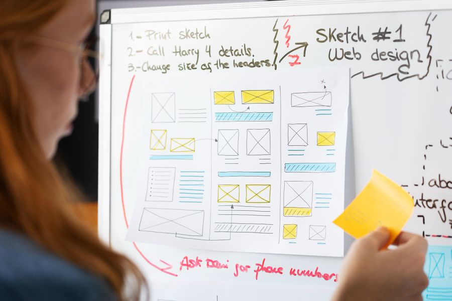
Team mapping information architecture on a whiteboard

UI Design & Experience

Design Direction

A clean, enterprise-grade UI that balances power with simplicity.

UI Enhancements

  • Clear data tables with visual hierarchy
  • Contextual actions instead of dense menus
  • Consistent component styling
  • Visual cues for status, payments, and alerts

Designed For

  • Customers managing accounts
  • Employees handling complex billing scenarios
Designer reviewing UI components

Usability Testing & Validation

Testing Approach

Validation was conducted with real users and real environments.

Who Participated

  • Call center employees
  • Recruited end customers

What We Measured

  • Task completion time
  • Error rates
  • Ease of learning
  • Satisfaction levels

Key Result

Significant reduction in task time and cognitive effort.

Participant during a usability testing session

Results & Impact

Quantified Improvements

  • 35% overall system efficiency improvement
  • Faster task completion across billing actions
  • Reduced customer dependency on call centers
  • Improved accuracy and learnability

Business Outcomes

  • Better digital adoption
  • Lower support costs
  • Increased confidence in billing workflows
Team celebrating project results Dashboard showing improved metrics

Organizational Impact

Leadership Buy-In

Findings were presented to the CPO and decision board, resulting in:

  • Strong executive alignment
  • Validation of UX-led approach
  • Additional opportunities across business lines

Why It Worked

  • Evidence-backed design decisions
  • Clear ROI articulation
  • User-centered problem framing
Leadership team reviewing findings

Key Takeaways & Conclusion

UX Learnings

  • Deep user empathy drives better systems
  • Simplifying complexity unlocks scale
  • Call center insights are critical for service UX
  • Usability testing is not optional—it’s essential

Final Note

This project demonstrates how research-driven UX design can transform enterprise systems—improving both customer satisfaction and operational efficiency.

Liberty Mutual team in discussion
Our FAQ’s

Here are answers to some of the most common questions.

Discoverability issues, information overload, navigation reflecting org structure instead of customer goals, and low-visibility trust signals.
Instead of 'how do we simplify banking,' the team asked 'how do we help users make confident decisions faster.'
Key findings included that people scan before they read, visual structure builds trust, and complexity increases hesitation.
Prioritize user intent, reduce cognitive load, create predictable patterns, and surface critical actions.
Through WCAG-compliant inclusive interfaces, device-agnostic experiences, and international-readiness for diverse audiences.

Get in touch!

© 2026 | All rights reserved