A tablet-first UX case study for Chase leadership dashboards.
Reimagining Executive Decision-Making on a 9.5” Screen
An award-winning executive dashboard designed for JPMorgan Chase leadership, enabling CEOs to monitor performance across multiple business verticals—anytime, anywhere.


Designing for Executive Reality
Senior leaders needed a single, reliable view of enterprise performance, optimized for:
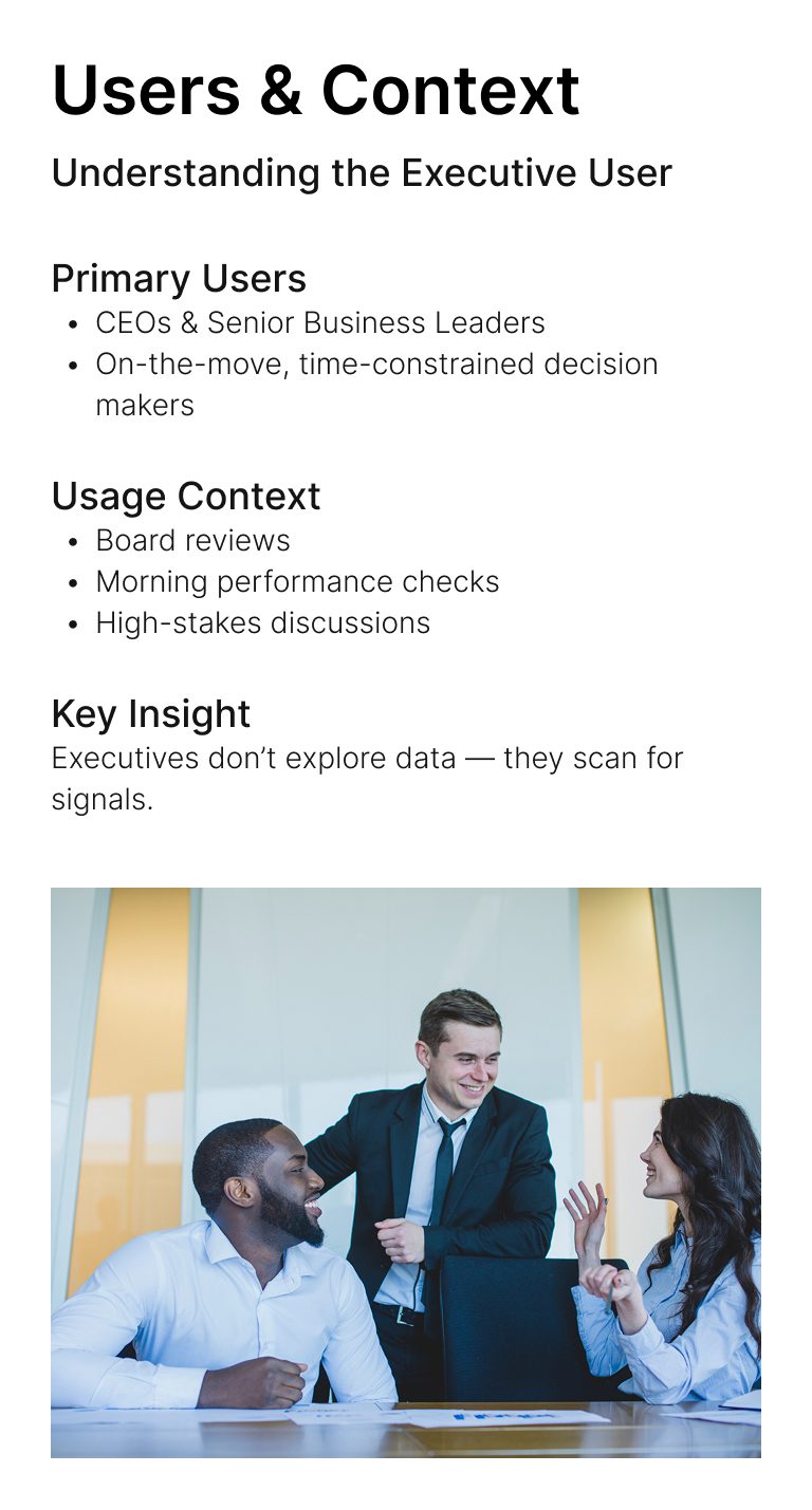
Understanding the Executive User
Executives don’t explore data — they scan for signals.

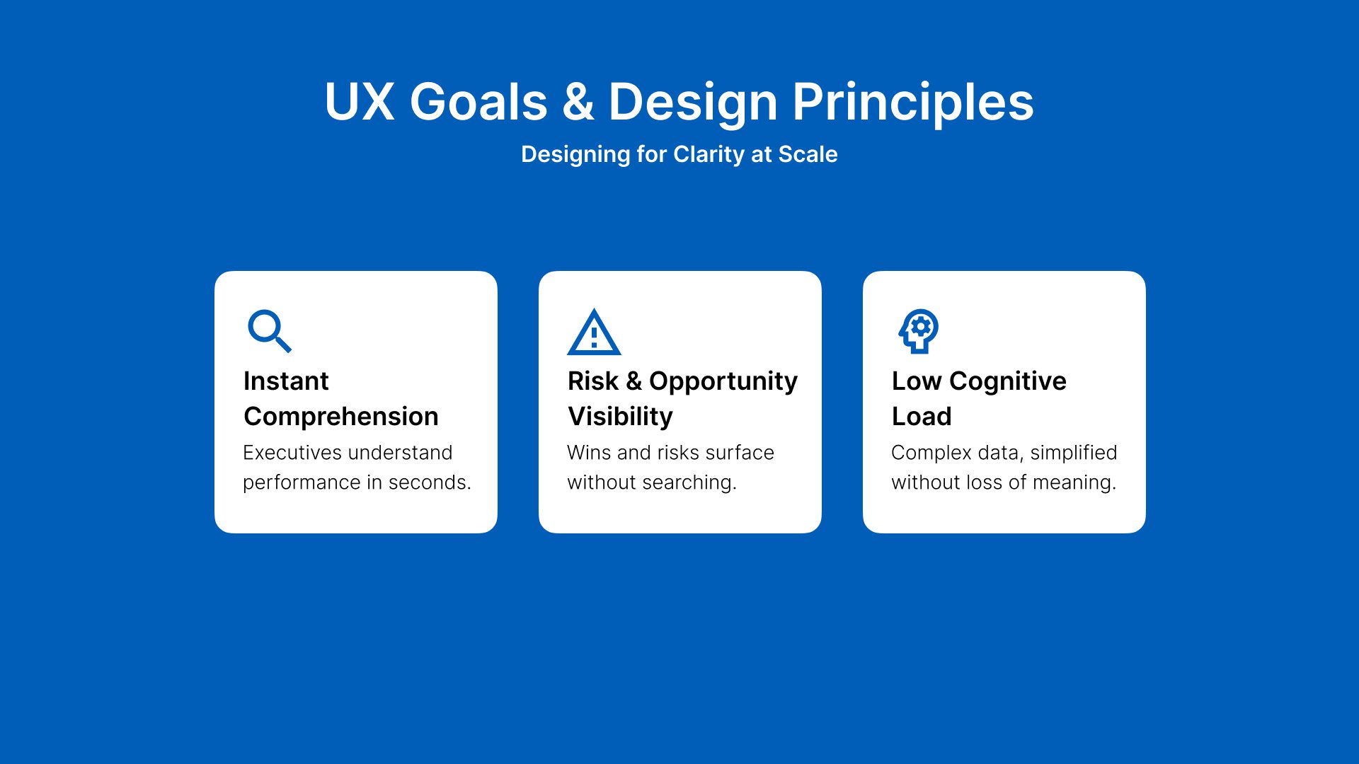
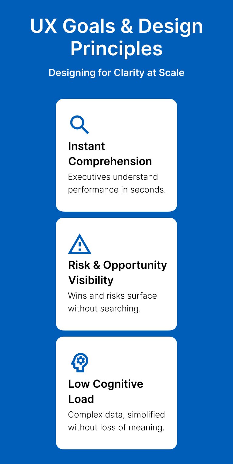
Designing for Clarity at Scale
Executives understand performance in seconds.
Wins and risks surface without searching.
Complex data, simplified without loss of meaning.
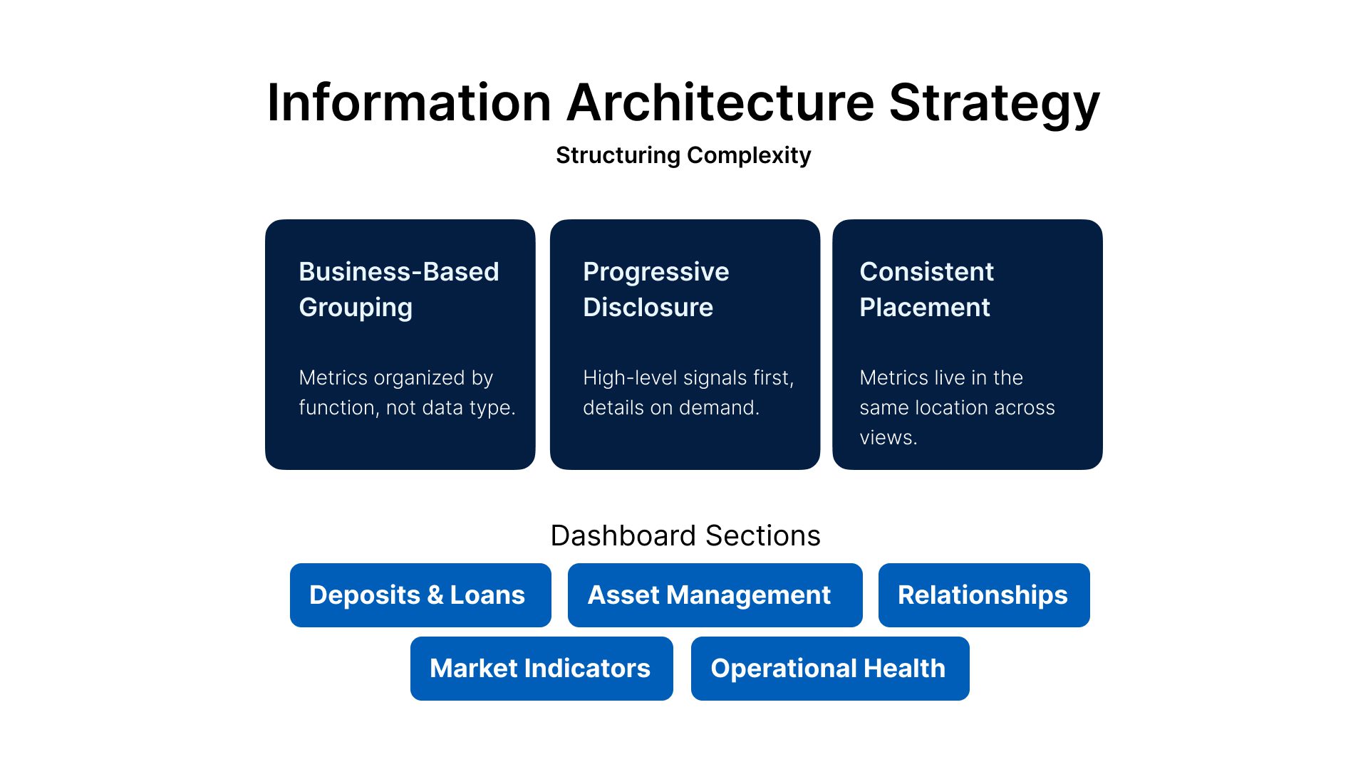
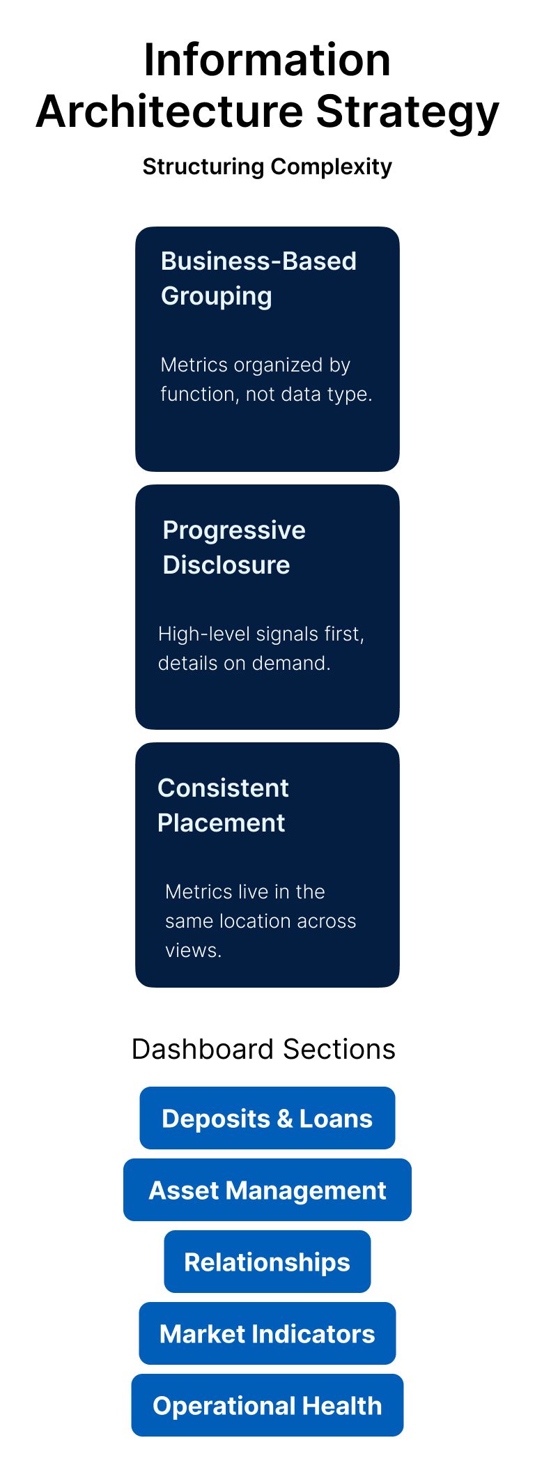
Structuring Complexity
Metrics organized by function, not data type.
High-level signals first, details on demand.
Metrics live in the same location across views.
Dashboard Sections
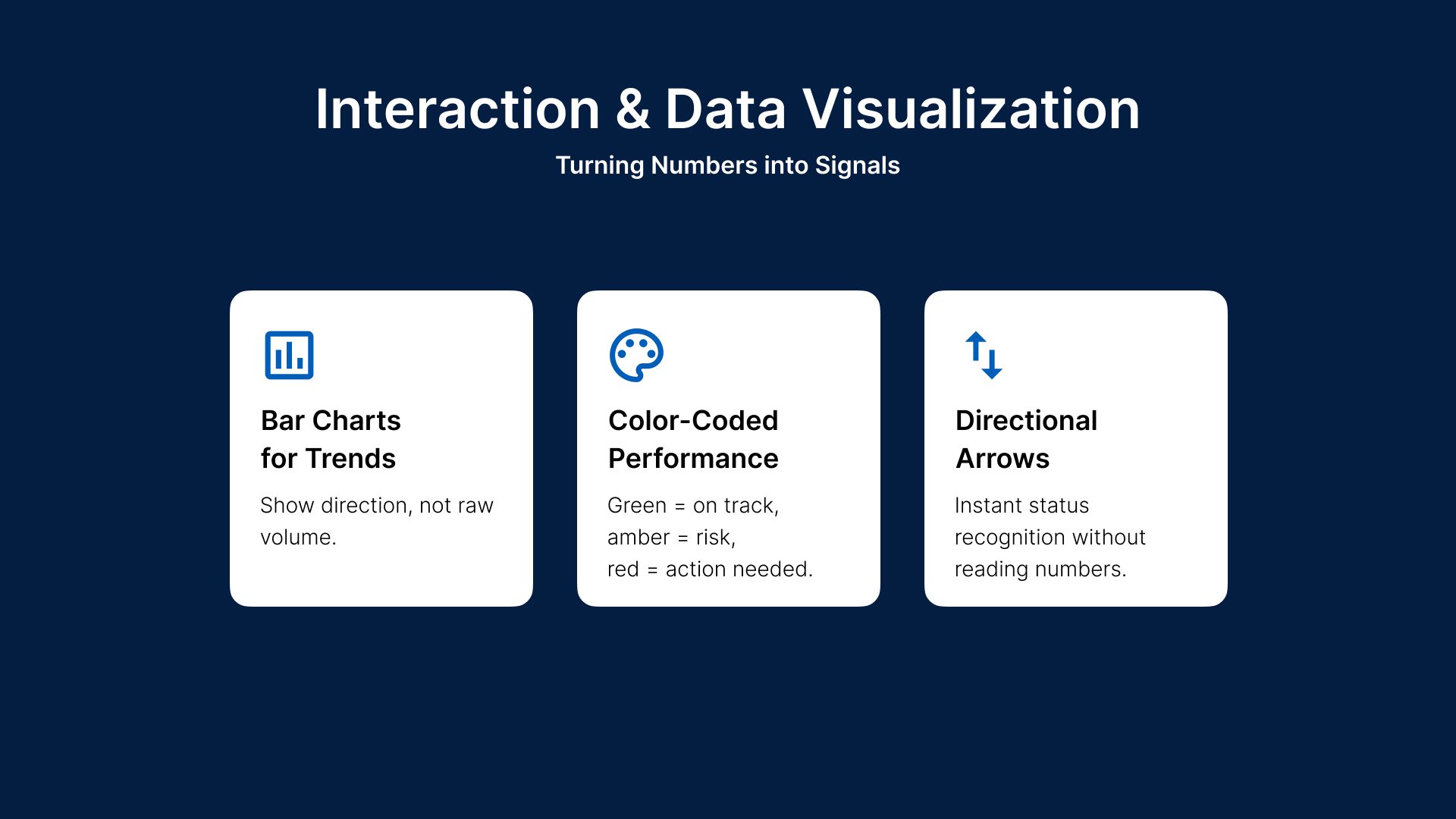
Turning Numbers into Signals
Show direction, not raw volume.
Green = on track, amber = risk, red = action needed.
Instant status recognition without reading numbers.

Measurable UX & Business Outcomes

Great executive UX is invisible — but its impact isn’t.


MAKEGet in touch!
© 2026 | All rights reserved

MAKE