Chase executive reviewing dashboard on tablet

Designing Clarity for Executive Decision-Making

A tablet-first UX case study for Chase leadership dashboards.

Case Study Overview

Reimagining Executive Decision-Making on a 9.5” Screen

Context

An award-winning executive dashboard designed for JPMorgan Chase leadership, enabling CEOs to monitor performance across multiple business verticals—anytime, anywhere.

Scope

  • Consumer Business Banking
  • Executive Reporting
  • Tablet-first Experience
Executive reviewing dashboard on tablet Close-up of dashboard interface
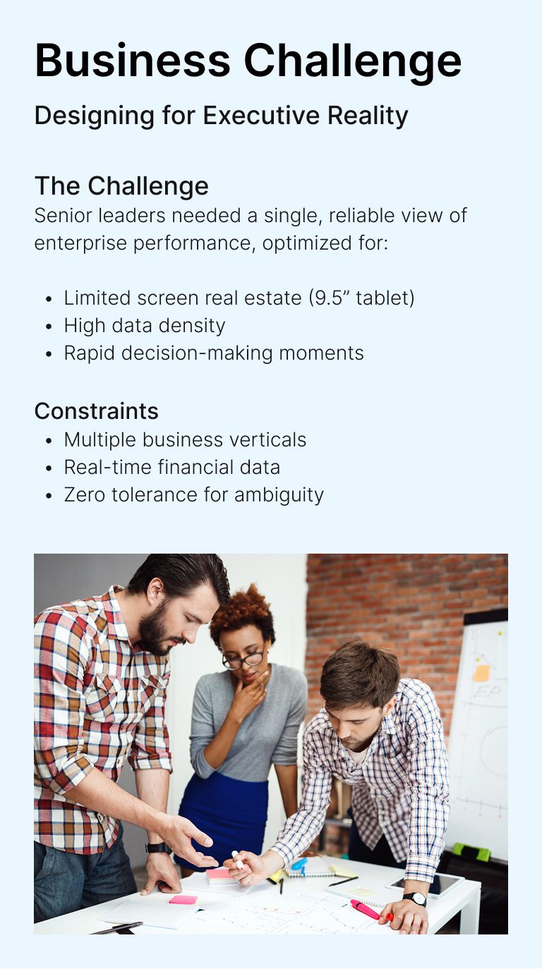
Team collaborating in a business meeting

Business Challenge

Designing for Executive Reality

The Challenge

Senior leaders needed a single, reliable view of enterprise performance, optimized for:

  • Limited screen real estate (9.5” tablet)
  • High data density
  • Rapid decision-making moments

Constraints

  • Multiple business verticals
  • Real-time financial data
  • Zero tolerance for ambiguity

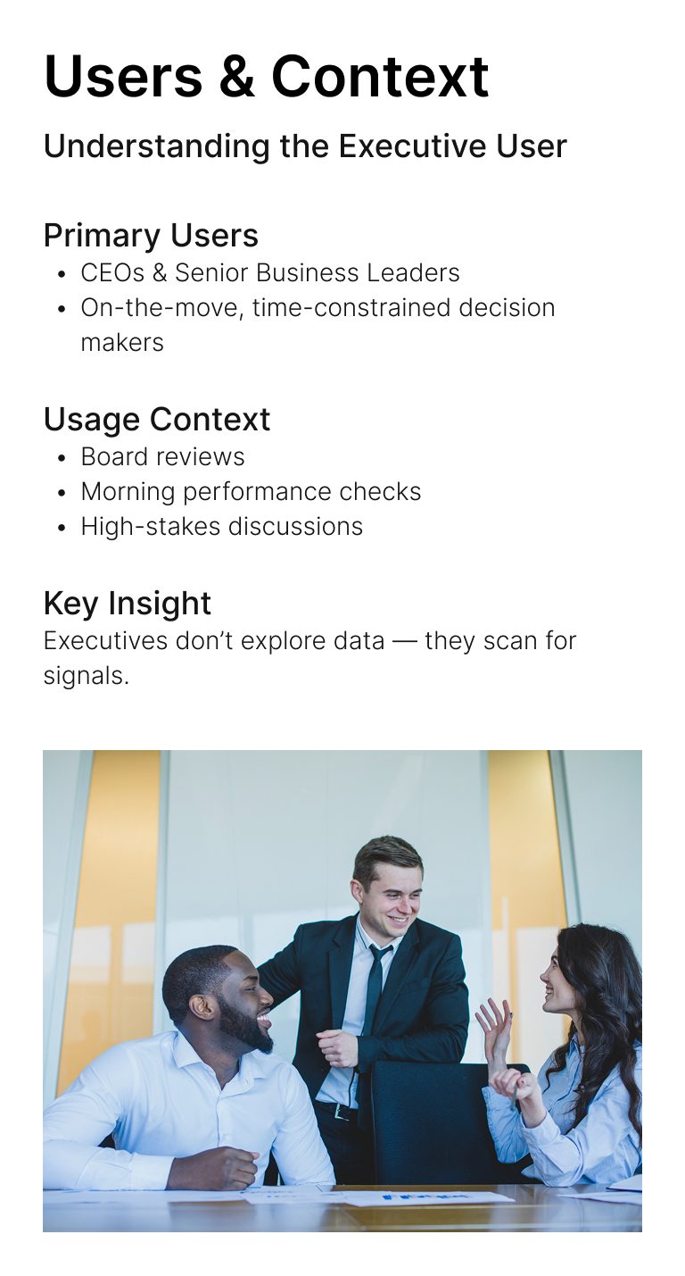
Users & Context

Understanding the Executive User

Primary Users

  • CEOs & Senior Business Leaders
  • On-the-move, time-constrained decision makers

Usage Context

  • Board reviews
  • Morning performance checks
  • High-stakes discussions

Key Insight

Executives don’t explore data — they scan for signals.

Executive reviewing reports

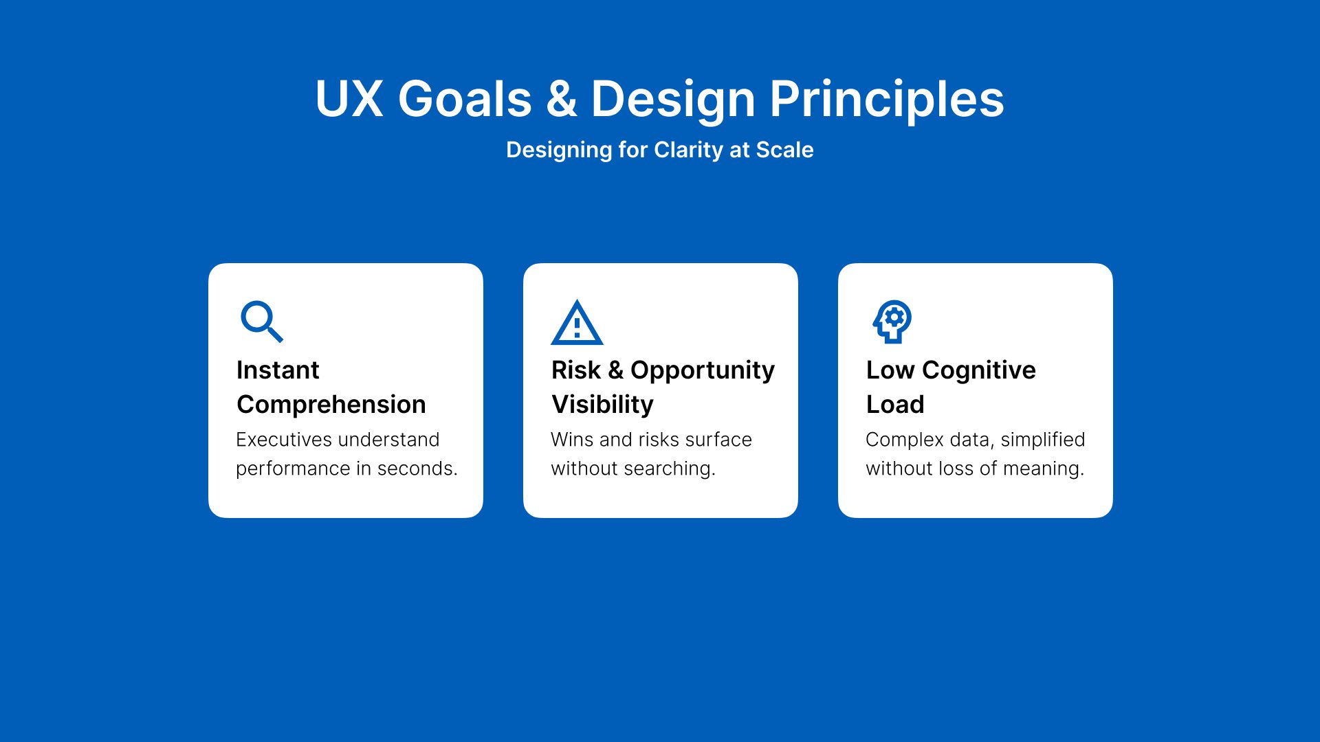
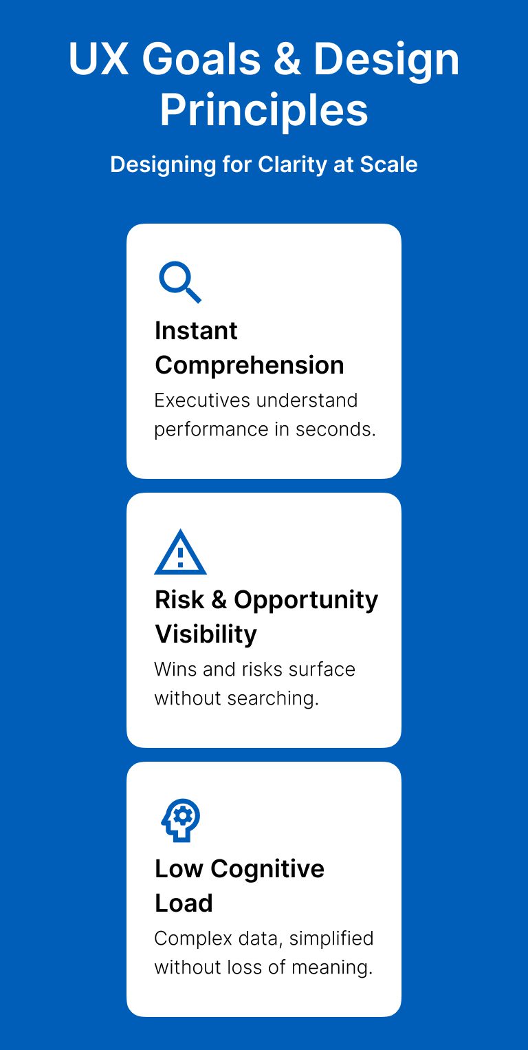
UX Goals & Design Principles

Designing for Clarity at Scale

Instant Comprehension

Executives understand performance in seconds.

Risk & Opportunity Visibility

Wins and risks surface without searching.

Low Cognitive Load

Complex data, simplified without loss of meaning.

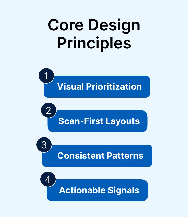
Core Design Principles

1
Visual Prioritization
2
Scan-First Layouts
3
Consistent Patterns
4
Actionable Signals

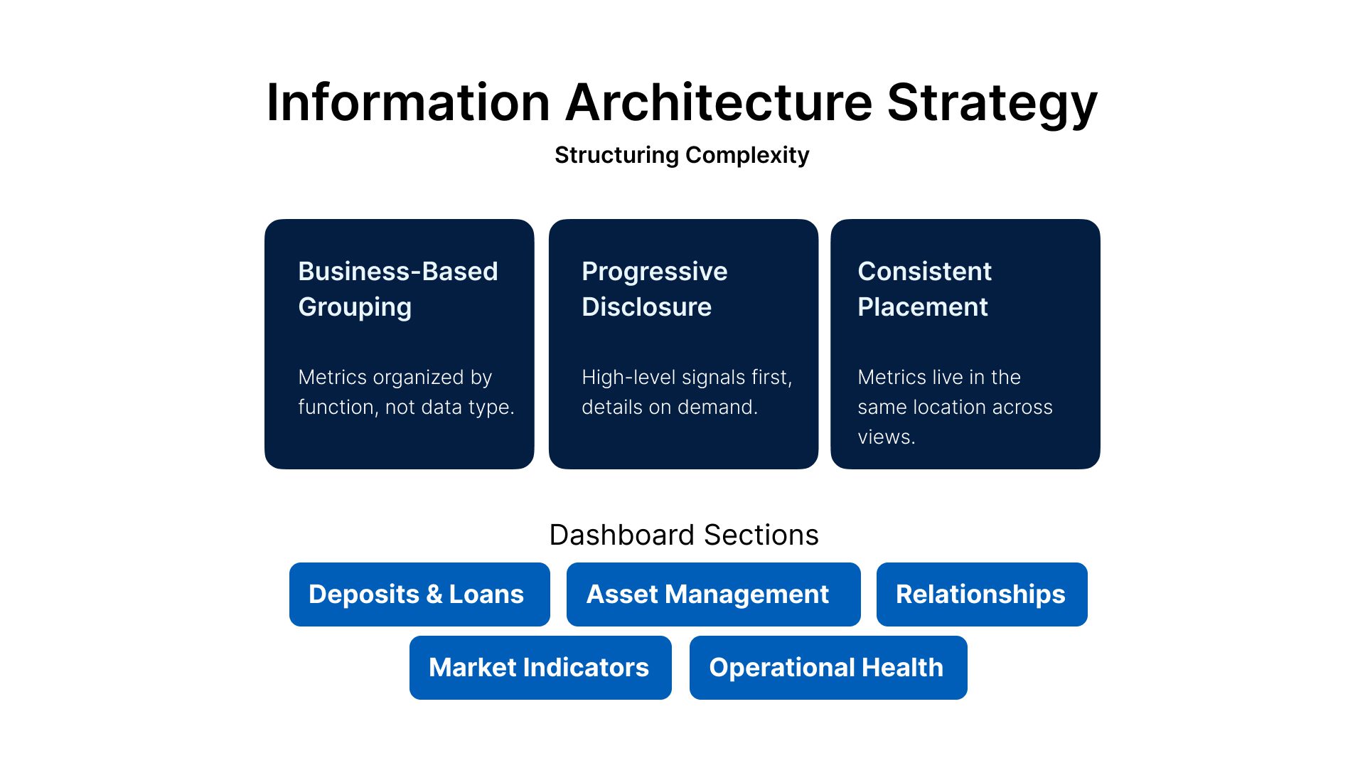
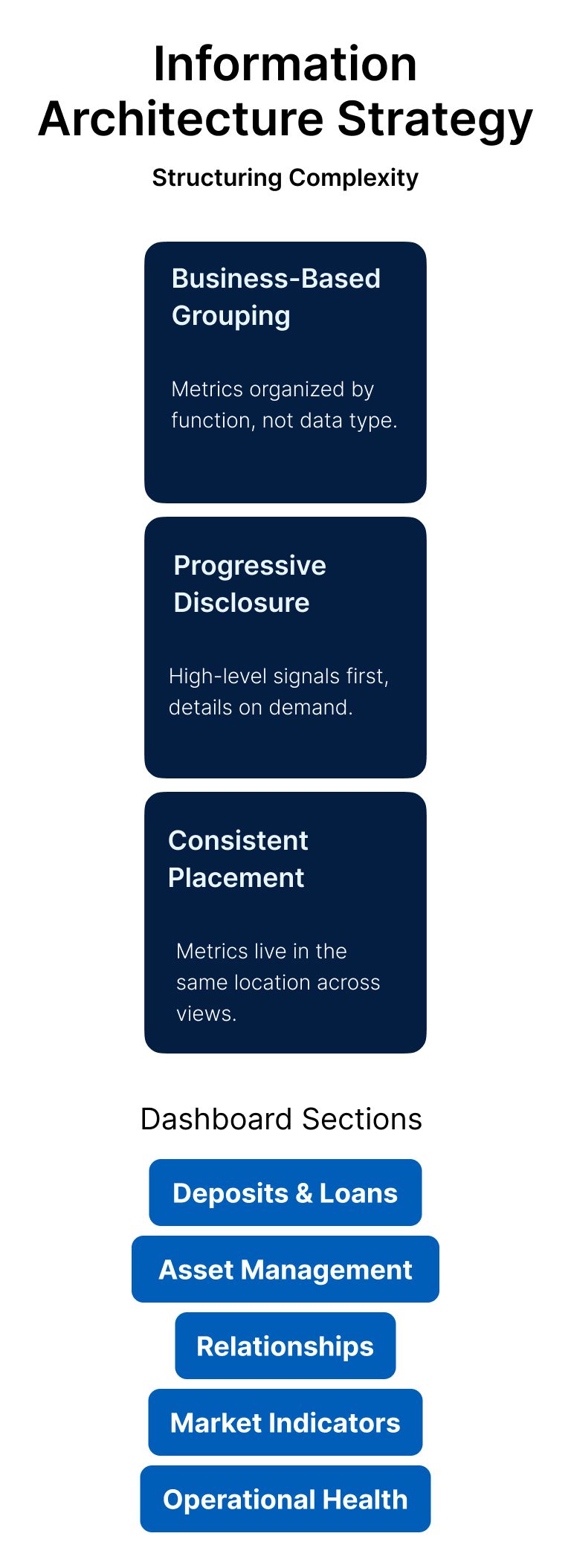
Information Architecture Strategy

Structuring Complexity

Business-Based Grouping

Metrics organized by function, not data type.

Progressive Disclosure

High-level signals first, details on demand.

Consistent Placement

Metrics live in the same location across views.

Dashboard Sections

Deposits & Loans
Asset Management
Relationships
Operational Health
Market Indicators

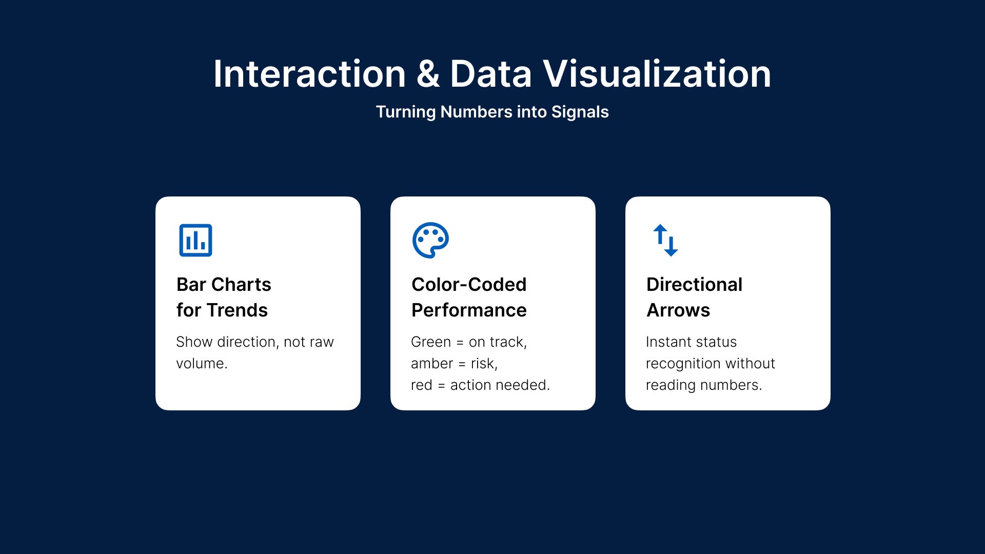
Interaction & Data Visualization

Turning Numbers into Signals

Bar Charts for Trends

Show direction, not raw volume.

Color-Coded Performance

Green = on track, amber = risk, red = action needed.

Directional Arrows

Instant status recognition without reading numbers.

Results & Impact

Measurable UX & Business Outcomes

UX Impact
Faster performance assessment
Reduced reliance on static reports
Improved alignment across leadership
Business Value
Widely adopted across leadership teams
Recognized as an award-winning solution
Set a benchmark for executive dashboards
Executive using the dashboard

Key Learnings & Takeaways

Key Learnings

  • Clarity beats completeness
  • Visual hierarchy drives trust
  • Dashboards are decision tools, not data dumps
  • Designing for executives means designing for moments

Final Thought

Great executive UX is invisible — but its impact isn’t.

Chase building exterior
Our FAQ’s

Here are answers to some of the most common questions.

Discoverability issues, information overload, navigation reflecting org structure instead of customer goals, and low-visibility trust signals.
Instead of 'how do we simplify banking,' the team asked 'how do we help users make confident decisions faster.'
Key findings included that people scan before they read, visual structure builds trust, and complexity increases hesitation.
Prioritize user intent, reduce cognitive load, create predictable patterns, and surface critical actions.
Through WCAG-compliant inclusive interfaces, device-agnostic experiences, and international-readiness for diverse audiences.

Get in touch!

© 2026 | All rights reserved